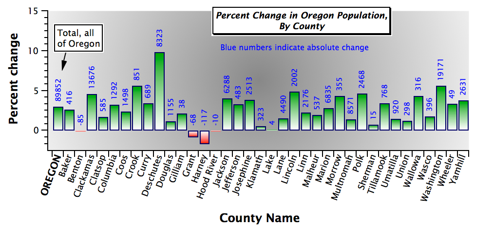
The blue labels are added by adding the Y data to the graph a second time, setting the plotting mode to markers, and selecting Text Markers. The wave selected for the text markers is a wave with those numbers (the actual change in population of each county). I then set the mode of the bars to Bars to Next so that the text is in the same category column as the bars.
And to be absolutely honest, since I wanted those blue labels to be all above the zero line, I created a duplicate of the wave and set all the negative values to zero.
That graph, by the way, is in an example experiment file that ships with Igor. Select File->Example Experiments->Sample Graphs->Demo Experiment #2.
August 22, 2018 at 03:39 pm - Permalink
In case it is of use, here is a function that tags all points of a trace: https://www.wavemetrics.com/code-snippet/tag-each-point-trace
August 22, 2018 at 05:02 pm - Permalink
Thanks, this is very helpful.
August 23, 2018 at 10:35 am - Permalink