XY plots include line, marker, area and bar types along with a variety of derived types such as layer and stacked bar.
Graphs with one point thick lines or dots have extra optimization for speed. You can use graphs to monitor real-time data acquisition with update rates of 30 times per second even with tens of thousands of data points.
In addition to plotting one data column vs another, Igor Pro® has special support for evenly spaced data allowing you to plot a data column vs x values calculated from properties stored with the data itself. See data storage for other properties Igor can associate with data sets.
Igor's New Graph dialog allows you to create graphs with multiple axes and multiple XY pairs in a single step. Individual traces can be designated to plot horizontally or vertically and you can specify individual rows or columns from a matrix. As with all Igor dialogs, you can select from data sets anywhere in the entire workspace without leaving the dialog.
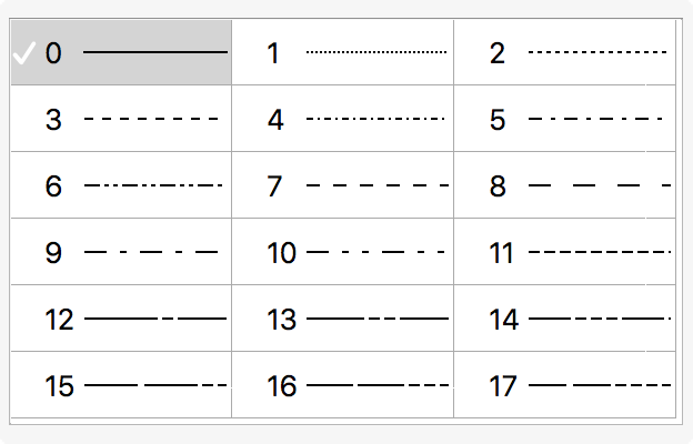
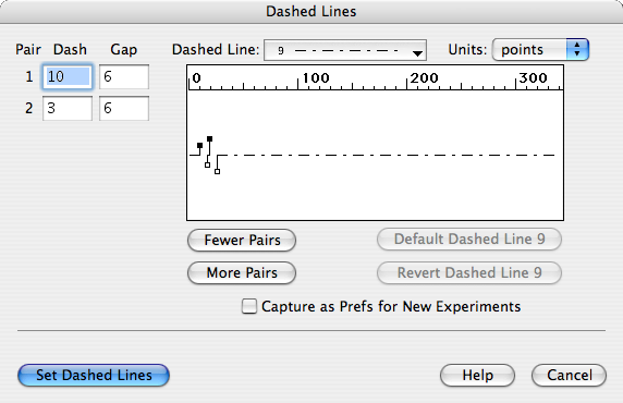
Each trace can be individually set to the desired style at any time either by double clicking to visit a dialog or by right-clicking to use a contextual menu. Display styles involving lines can pick from 18 different line styles and you can even invent your own styles using the Dashed Line editor.
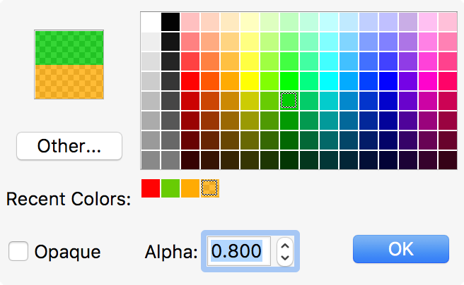
Colors of objects (lines, markers, axes etc.) can be picked from Igor's color popup shown at right. You can add your own colors or, for exacting needs, can even set the color from numeric red, green, blue, and transparency values.
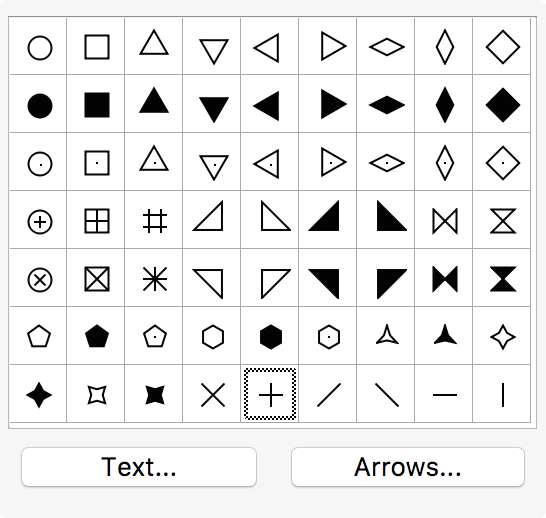
You can pick from a palette of 63 marker styles and can choose the stroke color separately from the fill. You can choose between transparent or opaque and can specify the precise stroke thickness. You can also use characters or text strings as well as arrows (for gradient diagrams) and wind barbs as markers. You can create custom markers that can add to or replace existing markers.
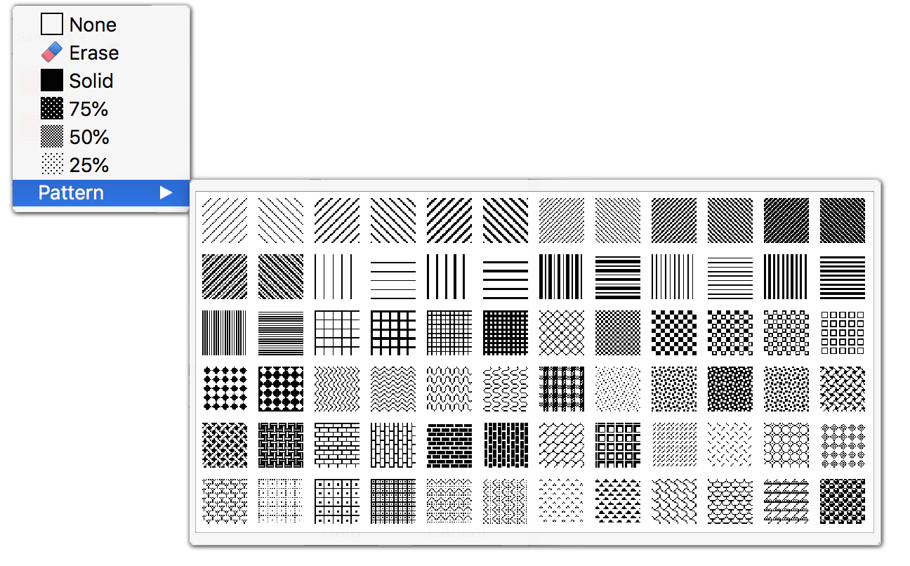
Styles involving fills (bars, fill to zero, fill to next) can choose from gray scales or patterns. Positive and negative fills can have different fill patterns and colors. See Layer Graphs below for an example.
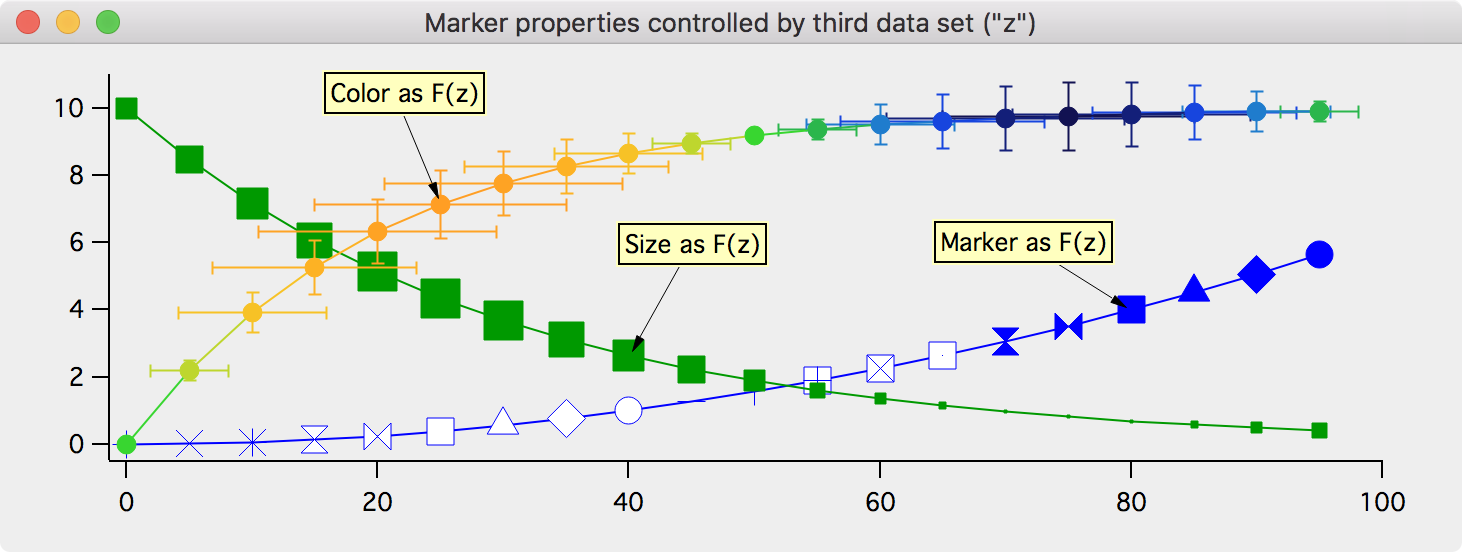
Color, marker size and marker style can be set as a function of an auxiliary data set. See Enhanced XY Plotting below for examples.
Igor automatically adjusts axis properties to optimize appearance and readability for the current data range and graph size. Of course, you can override and tweak automatic settings to any degree desired.
Built-in axis types are linear, log10, log2 and date/time. Standard packages add derived types such as probability and reciprocal. These packages illustrate how Igor's powerful programming capabilites benefit non-programmers by allowing others to extend Igor's capabilities. You choose a standard package from the main menu bar just like built-in operations.
Graph examples
Here are a few example that illustrate some of the features of Igor XY plots. See the gallery for many more examples.
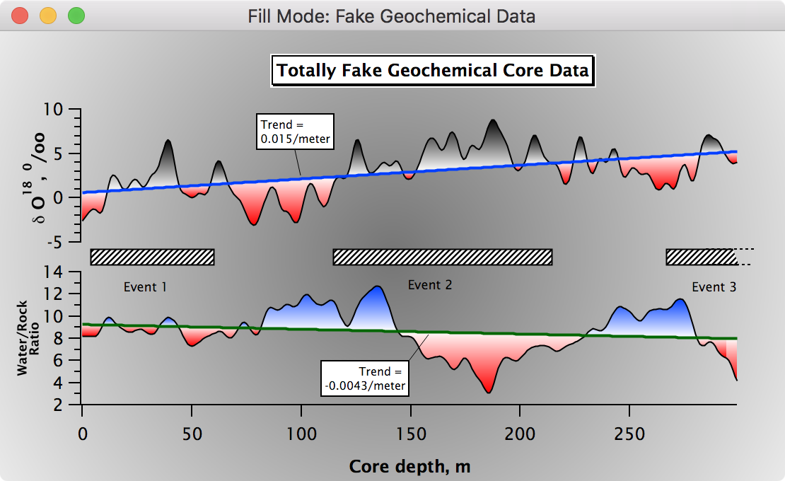
Layer Graphs
Here are examples of the fill-to-next mode, with different positive and negative fills:
Enhanced XY Plotting
The color and size of each marker in the graph varies to show the depth and magnitude of earthquakes.
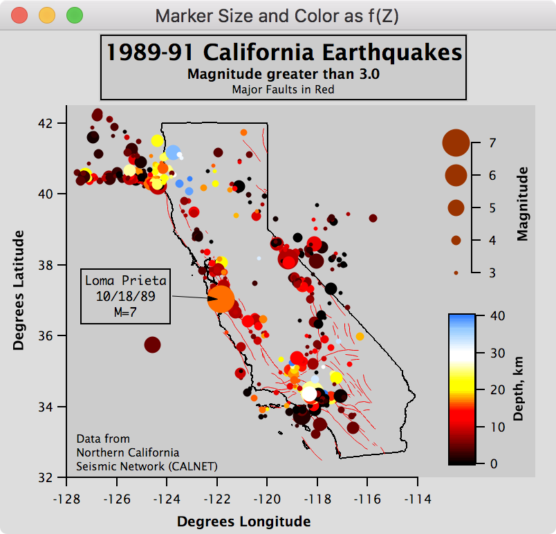
The data consists of:
- An array of longitude values (X)
- An array of latitude values (Y)
- An array of corresponding magnitudes
- An array of corresponding depths
Each array has the same number of entries. We displayed latitude vs longitude, selected markers mode with the filled circle marker, specified that the depth values should select colors from the BlueHot color table, and that the magnitude values should select the marker size.
The next graph demonstrates an array's values specifying a marker shape, size, or color for each data point:
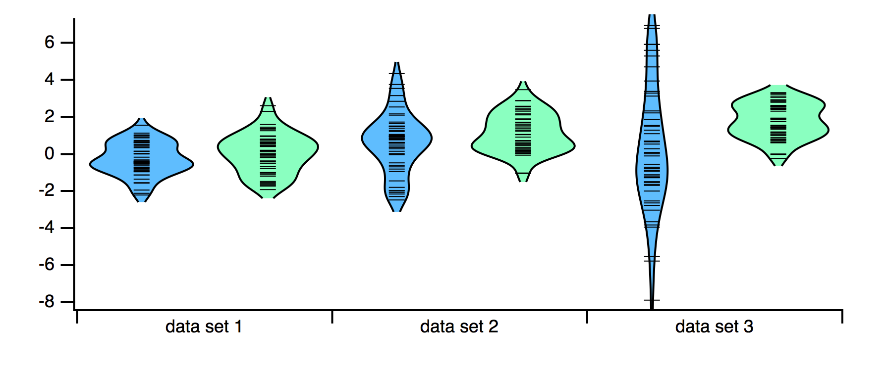
Violin and "Rug" Plots
A violin plot, also called a bean plot, is a way to summarize the distribution of data. A violin plot shows the distribution of a data set using a kernel density estimate (KDE).
In a violin plot, the curve is in general plotted vertically and reflected across the midline to give a plot that looks somewhat like a violin or a green bean pod with lumps for each seed.
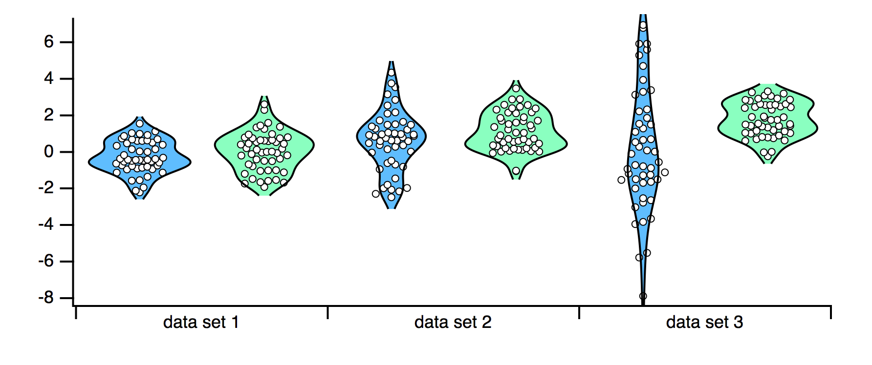
A "rug plot" replaces the cloud of markers representing the raw data with a single horizontal marker (when the "violin" is vertical), or a vertical marker if the violin is horizontal.
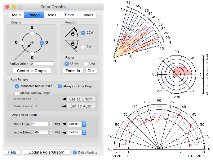
Polar Plots
Polar plots are provided by means of a standard package. Here is a view of the polar plot control panel and a few example plots:

Forum

Support
Gallery
Igor Pro 10
Learn More
Igor XOP Toolkit
Learn More
Igor NIDAQ Tools MX
Learn More