
We use the term "controls" for the user-interface objects that can be added to panels or graphs. The term "widgets" is sometimes used by other application programs.
Here is a summary of the types of controls available:
|
Control Type |
Control Description |
Examples |
| Button | When clicked, calls a procedure that the programmer has written. Custom buttons can be made from imported bitmaps. |
 |
| Chart | Emulates a mechanical chart recorder. Charts can be used to monitor data acquisition processes or to examine a long data record. Programming a chart is quite involved. | 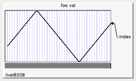 |
| CheckBox | Sets an off/on value for use by the programmer´s procedures. Radio buttons and disclosure triangles are specializations of Checkbox. Custom checkboxes can be made from imported bitmaps. | 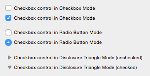 |
| CustomControl | Custom control type completely specified and modified by the programmer. | 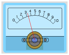 |
| GroupBox | An organizational element that groups controls with a box or line. |  |
| ListBox | Lists items for viewing or selecting. |  |
| PopupMenu | Used by the user to choose a value for use by the programmer´s procedures. |  |
| SetVariable | Sets and displays a numeric or string global variable. The user can set the variable by clicking or typing. For numeric variables, the control can include up and down buttons for incrementing or decrementing the value stored in the variable. |  |
| Slider | Duplicates the behavior of a mechanical slider. Selects either discrete or continuous values. | 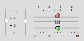 |
| TabControl | Selects between groups of controls in complex panels. | 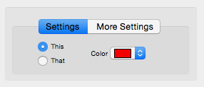 |
| TitleBox | Provides explanatory text or message. | 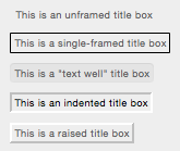 |
| ValDisplay | Presents a readout of a numeric expression which usually references a global variable. The readout can be in the form of numeric text or a thermometer bar or both | 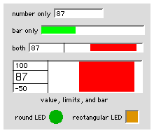 |
Forum

Support
Gallery
Igor Pro 10
Learn More
Igor XOP Toolkit
Learn More
Igor NIDAQ Tools MX
Learn More