The key is to double-click the first trace on the graph to bring up the Modify Trace dialog. With the first trace in the list selected, from the Grouping popup near the bottom of the Properties list, select "Keep with next". That will plot the bars for both traces in the same slot in the category plot.
To adjust the space between the bars, double-click the category axis to bring up the Modify Axis dialog. On the Axis tab, set the Category Gap.
There appears to be no way to get the standard axis grid lines to be centered on the category label. You could use draw tools to add lines to the graph in the appropriate places. As long as you don't offset the bars as recommended by Andy Hegedus, you can use axis coordinates to place the lines on the category plot; the space between the first and second bars is at X=1. To center lines on the bars, draw at X=0.5, 1.5, etc.
To learn more about category plots and the grouping modes: DisplayHelpTopic "Stacked Bar Charts". There's a lot of detailed info in the Category Plots help file: Help->Help Windows->Category Plots.ihf.
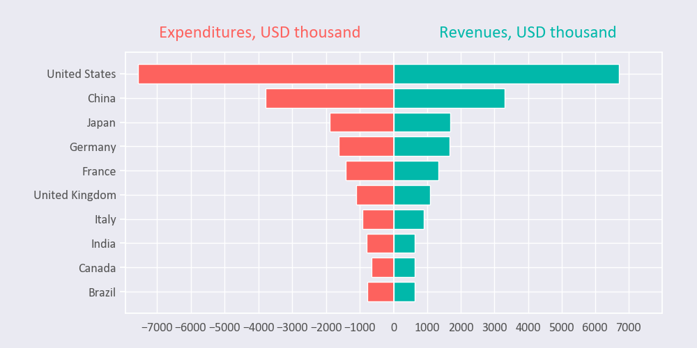
How about plotting two category plots each covering half of the width of the plot. This way the 'bottom' axis can go positive in each direction. Something like this:


Hi,
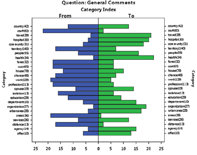
I played around with this using category plots and a dedicated left axis. My process:
1. Create a the basic category plot with both sets of data and the text labels wave.
2. Offset the second wave by -0.5 in the x to align them.
3. Double click in the corner of the graph to bring up the modify graph dialog box and select "Swap X & Y"
4. Modify axis to show zero line on axis.
Andy
August 21, 2023 at 06:06 pm - Permalink
hello,
Here, I extend a question: how to adjust the location of the grids?
thank you all.
August 22, 2023 at 03:32 am - Permalink
In reply to Hi, I played around with… by hegedus
cody.larsenPerfect, thank you!
August 22, 2023 at 07:03 am - Permalink
The key is to double-click the first trace on the graph to bring up the Modify Trace dialog. With the first trace in the list selected, from the Grouping popup near the bottom of the Properties list, select "Keep with next". That will plot the bars for both traces in the same slot in the category plot.
To adjust the space between the bars, double-click the category axis to bring up the Modify Axis dialog. On the Axis tab, set the Category Gap.
There appears to be no way to get the standard axis grid lines to be centered on the category label. You could use draw tools to add lines to the graph in the appropriate places. As long as you don't offset the bars as recommended by Andy Hegedus, you can use axis coordinates to place the lines on the category plot; the space between the first and second bars is at X=1. To center lines on the bars, draw at X=0.5, 1.5, etc.
To learn more about category plots and the grouping modes: DisplayHelpTopic "Stacked Bar Charts". There's a lot of detailed info in the Category Plots help file: Help->Help Windows->Category Plots.ihf.
August 22, 2023 at 10:16 am - Permalink
Oh, yeah- I recommend doing the manipulations *before* you apply the SwapXY to make the bars horizontal.
August 22, 2023 at 10:17 am - Permalink
In reply to Oh, yeah- I recommend doing… by johnweeks
KurtBHow about plotting two category plots each covering half of the width of the plot. This way the 'bottom' axis can go positive in each direction. Something like this:
August 23, 2023 at 11:43 pm - Permalink