Modifying Violin Plots in Igor 8


I just downloaded Igor 8 and I'm playing around with the built-in Violin Plot capability, but I'm running into a few barriers. I was wondering if there were any ways to work around the following issues:
1) I can't figure out how to re-order the violin plots once I plot them all. The process I used to load all my data into the violin plot was to use "Windows" -> "New" -> "Violin Plot..." and then select all the 1-D waves of interest. I know you can order them at this point in the "New Violin Plot" dialog window, but is there any way to re-order the waves after plotting?
2) How do I modify the colors of each violin plot differently? All my waves seem to be grouped into a single trace. When I use the "Modify Violin Plot" dialog box, the color/modifications are applied to all my violin plots on my graph.
Is there a way to display the 25th and 75th percentile? I only see the option to display the mean and median within the "Modify Violin Plot" dialog box.
Thank you in advance for any help!

Forum

Support

Gallery
Igor Pro 10
Learn More
Igor XOP Toolkit
Learn More
Igor NIDAQ Tools MX
Learn More
The way I found to do this is start with one data set and then append a violin graph to that original. Then in the modify violin plot you are given the option of modifying each group that is added.
Andy
July 23, 2018 at 11:30 am - Permalink
In reply to The way I found to do this… by hegedus
JoeKo91Thanks for the tip. I'll give this a go and see if this works for my needs.
July 23, 2018 at 01:00 pm - Permalink
In Igor 8 coloring the violin plots separately is pretty difficult, especially if you are using a category axis. The only way to do it is to make several separate waves with the appropriate number of columns (10 in your case). Fill all columns but one with NaN, make separate violin plots with each of those waves. In the Modify Trace Appearance dialog select all those violin plot traces and set the grouping mode to Keep With Next.
Now you have something that (should) look like your graph, but with a separate trace for each visible data set.
You will be glad to know that I have implemented per-dataset coloring (and other settings) for Igor 9. But Igor 9 is most likely a couple years away.
I'm happy to see my new box plots and violin plots getting so much use! I would be interested in any other comments you might have on them, as I don't have personal experience using them for presentations with real data. Back 23 years ago when I stopped being a scientist, violin plots were pretty much unknown, and I didn't have use for box plots. What you see in my implementation is the result of reading and Googling.
July 23, 2018 at 01:16 pm - Permalink
In reply to In Igor 8 coloring the… by johnweeks
JoeKo91Thanks John. I will also try this when I get a chance to sit down with Igor.
In terms of additional comments, having the option to customize the different violin plots easily would be amazing. Also, the option to display the quartiles in addition to the mean and median would also be useful. So something like a boxplot within the violin plot. I have used Python (Seaborn package) and R (ggplot2) for making violin plots before but wanted to try out the functionality in Igor since all my data for a specific project was loaded in Igor.
Looking forward to future improvements!
July 23, 2018 at 01:29 pm - Permalink
In reply to Thanks John. I will also try… by JoeKo91
johnweeksYou can combine violin plots with box plots. My Googling suggests that it is a common thing to do. After you make a violin plot, simply go to Graph->Add->Box Plot. Create your box plot with the same data and the same graph.
If you followed my advice for customizing each data set, unfortunately you will have to do that again with the box plots.
To make the box plots look right in combination with the violin plots, you will need to explicitly set the box width to look nice. There's a help topic that describes how: DisplayHelpTopic "Combining Box Plots and Violin Plots"
July 23, 2018 at 01:45 pm - Permalink
Hello John,
I'm currently trying to do what you suggested in your first comment, but I think I might be misunderstanding your suggestion because things are not plotting correctly.
"In Igor 8 coloring the violin plots separately is pretty difficult, especially if you are using a category axis. The only way to do it is to make several separate waves with the appropriate number of columns (10 in your case). Fill all columns but one with NaN, make separate violin plots with each of those waves. In the Modify Trace Appearance dialog select all those violin plot traces and set the grouping mode to Keep With Next."
I took this to mean that I should make 10 multi-dimensional waves with 10 columns each (N rows by 10 columns). Each of these multi-dimensional waves should be filled with NaN's, with the exception of one of the columns. I took this to mean 9 columns of NaN's and 1 column with the actual data of interest. Then I interpreted your directions to mean making a violin plot initially with one wave, and then appending the rest of the waves one by one.
Now you have something that (should) look like your graph, but with a separate trace for each visible data set.
I must be doing something completely off because I either run into errors, or the traces get grouped into the same category. My main question is, what is the purpose of creating waves with multiple columns? And even though I could get the violin plots to show up as different traces by appending them one-by-one, how can I get them in separate categories? It keeps automatically grouping them into the same category.
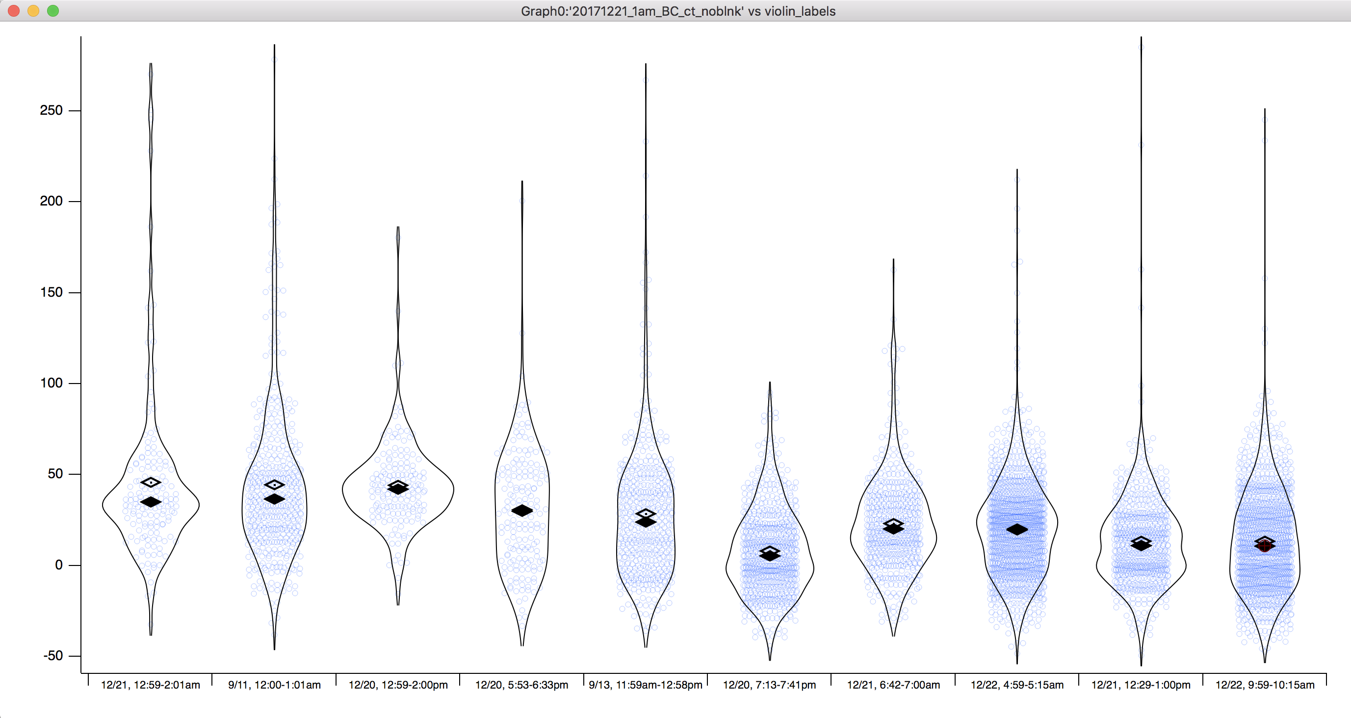
Any clarification or really specific directions would help a bunch. I've attached a few of the actual waves I'm working with. I attached 3 of them as examples. Thanks!
July 24, 2018 at 02:13 pm - Permalink
In reply to Hello John, I'm currently… by JoeKo91
johnweeksYeah, I wasn't sufficiently explicit about where to put the actual data. So each multi-column wave will have the data for one dataset. Put the first dataset into column 0 of the first wave, the second dataset into column 1 of the second wave, the third dataset into column 2 of the third wave, etc.
Since I see that you attached some of your data files, I gave it a try. You may wish to wait until I have fixed the bug that causes Igor to go into an infinite loop, printing " UpdtDisplay: recursion attempted" over and over into the history...
July 24, 2018 at 02:51 pm - Permalink
Ah, I guess it's a good sign that I got the same error too. I also got the infinite loop going on when I did just what you described. Thanks for the follow up.
July 24, 2018 at 02:52 pm - Permalink
I have fixed the bugs that prevented my scheme from working. When the next nightly build is available, it will have the fix. Be sure the build number (shown in the splash screen during start-up, and in Help->System Information) is at least 32125.
I have attached an experiment file with JoeKo91's data making a category-axis-based violin plot (and a box plot for good measure) with different coloring for each data set.
HOWEVER- Igor 9 will supersede this technique, which is at best a kludge. I will be checking up on y'all to make sure that you get Igor 9 when it's available!
July 25, 2018 at 01:40 pm - Permalink
Sweet! Thanks for the helpful responses John!
July 25, 2018 at 01:44 pm - Permalink
To revive this thread, I noticed that (at least in Igor 8, maybe this is already planned in 9) applying a f(z) function for data point coloring, marker sizing, etc. doesn't work with violin plots. It lets you set it up, but doesn't actually apply itself to the data (unless there is a trick to this?). This might make the plot way too busy anyway, but I thought it might be useful for one of my data sets and thought I'd mention it.
November 30, 2020 at 09:18 am - Permalink
Right- a set of box plots or violin plots is just a trace, but the "points" on the trace are the boxes (or violins) themselves. Igor's normal trace-drawing code knows nothing about the box plot data points.
For Igor 9, which is currently in beta test, I have added the ability to control the colors, sizes and markers used for the data points in both box plots and violin plots. To learn more: https://www.wavemetrics.com/forum/news-and-announcements/igor-pro-9-beta
November 30, 2020 at 01:21 pm - Permalink
In reply to Right- a set of box plots or… by johnweeks
Ben Murphy-BaumGreat, thank you!
December 1, 2020 at 10:18 am - Permalink