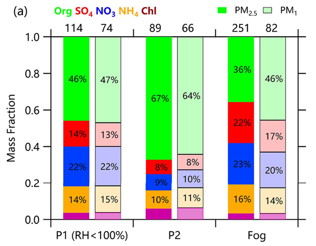
Mass fraction plot in bars


Hello everyone,
I have a dataset of five concentrations of different chemical species over time series and would like to plot them as a fraction in bars (so the stacked plot of the species will result in a total of 1 or 100% on the graph). This works easily with 2D pie chart because it automatically calculates for you the fraction/percentage of each species' concentration.
What I did: I converted the mass of each concentration into a fraction. I tried to use the "stick to next" mode and "stack on next" grouping since I think it's the closest that resembles what I want, but it doesn't create the plot I wanted. I want something to look like the picture but contain more points on the x-axis.
If you have any ideas or experiences I would really appreciate it!
Thank you very much.
make a category plot with mode = bars to next and grouping = add to next
June 17, 2022 at 07:23 am - Permalink