About scatter plot


Can anyone tell me how to make a scatter plot with different color/symbol/mark in the same group/column?
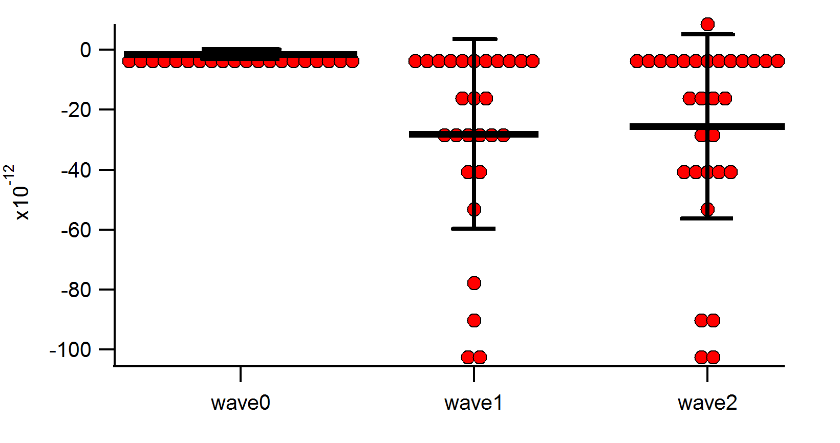
I had known how to make a scatter plot with mean and error in the same column, as shown in ''present working image''.
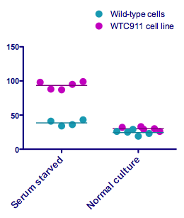
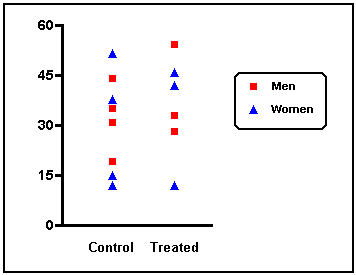
But, I need to present different colors/marks within the same groups . as the pictures indicated : ''wanted image''.
Can anyone help me out? I appreciate a lot.
Yingchun

--Jim Prouty
Software Engineer, WaveMetrics, Inc.
December 14, 2015 at 02:24 pm - Permalink
December 14, 2015 at 02:44 pm - Permalink
Thanks for replying. I tried ''right-click'' and customized the color/mark. It changed whole points in a same column.
I want to display the different color/mark in the two/ three groups of data points within the same column.
Thank you.
December 16, 2015 at 09:29 am - Permalink
To Jim:
Thank you very much. I think this is the information which I need.
But it seems a bit difficult for to encoding the Z wave for mark/color for me, because I am not familiar with the coding. I will try to figure out.
Thanks again. This is useful.
YCYu
December 16, 2015 at 09:37 am - Permalink