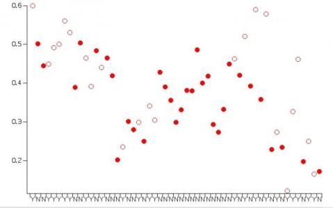
Category plot
I am likely missing something very basic here, but I am having trouble creating a category plot. I have a numerical wave (55pts) and created a text wave containing "YES" or "NO" for each of the 55 datapoints. When I try to create a new category plot, I am getting 55 bars (i.e. Igor is not separating the data by the two categories). See attached picture. I should be able to have Igor plot the data stacked on top of each other, having only 2 categories on the X-axis, right?
Any help would be greatly appreciated.


I was about to suggest a method but then decided I do not fully understand what you mean by "data stacked on top of each other."
Do you mean just plotting as symbols at one of two x locations or do you mean you need to add up previous values?
Do you want markers as you show there or do you need bars?
Here is what I was playing with:
August 3, 2009 at 02:17 pm - Permalink