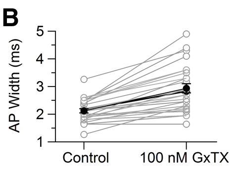
Hello Everyone, I am trying to create a scatter dot plot like the one in the picture attached. I used the scatter dot plot function and have managed to create my graph but I cannot figure out how to tell Igor to plot lines between corresponding data points in my two different categories. How can I draw lines between the corresponding data points?
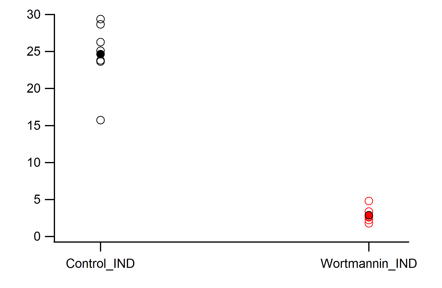
The first attachment is what I want my graph to look like and the second is what mine currently looks like now
Hello. The scatter dot plot function is not really meant for this type of plot.
To make the a plot like the example you posted I would do the following:
1. Make lots of waves with two points. (if you have them in two waves now, you can transpose them)
2. Plot them all versus _calculated
3. Select lines and markers for all
4. Make two more two point waves, one numeric (0,1) and one textwave (group1,group2).
5. Add user ticks to x-axis with numeric wave defining the position and the textwave providing the label.
sjr51 wrote: Hello. The scatter dot plot function is not really meant for this type of plot.
To make the a plot like the example you posted I would do the following:
1. Make lots of waves with two points. (if you have them in two waves now, you can transpose them)
2. Plot them all versus _calculated
3. Select lines and markers for all
4. Make two more two point waves, one numeric (0,1) and one textwave (group1,group2).
5. Add user ticks to x-axis with numeric wave defining the position and the textwave providing the label.
Thank you very much!!! This was a clever way of doing it. My figure looks great now.
I see that you've already made the graph as you'd like it. I'm the author of the Igor's Scatter Dot Plot package. sjr51 is right that it wasn't really made for this kind of plot. The biggest problem is that in order to make the scatter dot plot the data is first sorted, thus losing the best means of connection between wave values in different waves - the wave indices. I wrote a function that would, in most cases, provide a map from source wave indices to SDP wave indices. With that data available I wrote another function to make the lines. They appear to work in limited testing, but they'd require significant explanation and I can think of at least one case where they wouldn't work.
So given that you seem happy with your current results I'll hold off on posting the code and explanation. If you'd like to get that code email me at support, preferably with your experiment, and I'll be happy to help you out.
Came across this thread because I was having the same problem, and thought there should be an easier way to connect corresponding data points in two waves. The way I've implemented it is to have all the data points in a given category listed in a single wave. So for two categories you need two waves. I set the scale of each wave so that all the points line up vertically. For example, the control wave is scaled as
SetScale/I x,1,1.00001,controlWave
and the experimental wave is scaled as
SetScale/I x,2,2.00001,expWave
So the control data set lines vertically at x = 1, and the experimental group lines up at x=2.
Running catLines(1,2) will draw lines (Drawing Mode) to the corresponding data points. The input variables w1x and w2x are just the x scaling positions (x=1 and x=2 in the example I used). Right now the code assumes left and bottom axes are being used, but these can obviously be changed depending on the needs of the graph. The command applies to the top graph window.
Function catLines(w1x,w2x)

variable w1x,w2x

//finds waves in the top graph
wave w1 = TraceNameToWaveRef("",StringFromList(0,TraceNameList("",",",1),","))
wave w2 = TraceNameToWaveRef("",StringFromList(1,TraceNameList("",",",1),","))
variable w1_size,w2_size

//finds size of waves
w1_size = DimSize(w1,0)
w2_size = DimSize(w2,0)

//tests for equal wave length
If(w1_size != w2_size)
	print "Waves Not Equal Lengths"
	return 0
EndIf

//draws connector lines between corresponding data points
variable i
For(i=0;i<w1_size;i+=1)
	SetDrawEnv xcoord=bottom,ycoord=left,linethick=0.50
	DrawLine/W=# w1x,w1[i],w2x,w2[i]
EndFor

End
There's another kluge for doing this, which I have used. You need two waves, the y-wave holding the data (AP width in your example), and an x-wave specifying the column (the two treatment groups). The rows in each wave are conceptually grouped in triplets, with the first and second rows of each triplet holding the data to be connected by a line, and the 3rd row is NaN ("not a number") in x- and y-waves. Now you plot y- vs. x-wave as "lines and markers". The NaN breaks the line, making it appear to be a separate line. The attached image shows an example. The data in the table are plotted in the graph. The blank lines in the table are actually NaNs. It's a kluge.
Kluge or not, I like that idea. I needed to make a slope graph just now and wrote a quick snippet to do this for two 1D waves holding measurements for a control and test.
Function SlopeGraph(w0,w1)
	WAVE w0
	WAVE w1
	Variable numrows = numpnts(w0)

	// Sanity check if the waves are different lengths
	if(numpnts(w0) != numpnts(w1))
		Abort "Same number of points for both waves required."
	endif

	// Make 1D wave with gaps to define paired measurements
	Make/O/FREE/N=(numrows) w2=NaN
	Concatenate/O {w0,w1,w2}, slopeY
	MatrixTranspose slopeY
	Redimension/N=(3*numrows) slopeY

	// Define x-values
	Make/O/N=(3*numrows) slopeX=NaN
	SlopeX[0,*;3] = 0
	SlopeX[1,*;3] = 1
	// Plot slope graph
	DoWindow/K slopePlot
	Display/N=slopePlot slopeY vs slopeX
	SetAxis/A/N=1/E=1 left
	SetAxis bottom -0.5,1.5
	ModifyGraph mode=4,marker=19,rgb=(0,0,0)
	// Labelling
	Label left "Measurement"
	Make/O/T/N=(2) labelWave = {"Ctrl","Test"}
	Make/O/N=(2) labelPos=p
	ModifyGraph userticks(bottom)={labelPos,labelWave}
End


To make the a plot like the example you posted I would do the following:
1. Make lots of waves with two points. (if you have them in two waves now, you can transpose them)
2. Plot them all versus _calculated
3. Select lines and markers for all
4. Make two more two point waves, one numeric (0,1) and one textwave (group1,group2).
5. Add user ticks to x-axis with numeric wave defining the position and the textwave providing the label.
October 15, 2014 at 02:30 pm - Permalink
Thank you very much!!! This was a clever way of doing it. My figure looks great now.
-Matt
October 15, 2014 at 03:07 pm - Permalink
So given that you seem happy with your current results I'll hold off on posting the code and explanation. If you'd like to get that code email me at support, preferably with your experiment, and I'll be happy to help you out.
Nate Hyde
WaveMetrics
support@wavemetrics.com
October 15, 2014 at 04:21 pm - Permalink
and the experimental wave is scaled as
So the control data set lines vertically at x = 1, and the experimental group lines up at x=2.
Running catLines(1,2) will draw lines (Drawing Mode) to the corresponding data points. The input variables w1x and w2x are just the x scaling positions (x=1 and x=2 in the example I used). Right now the code assumes left and bottom axes are being used, but these can obviously be changed depending on the needs of the graph. The command applies to the top graph window.
November 2, 2016 at 04:55 pm - Permalink
-Matthew
November 18, 2016 at 07:16 am - Permalink
November 19, 2016 at 01:41 pm - Permalink