Graph legends for violin plots


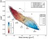
I just did my first violin plot (looks cool!), but I struggled to easily get a legend on.
Going via "Add annotation" -> "Legend" gives no meaningful default for \s(TraceSymbol). My work-around for 4 datasets was simply to color the legend text with \K(r,g,b). I wonder if there is a more straight forward way.
I think the legend shows the style of the trace lines (the data points are just a 'bonus' and can also be disabled). So you rather want to make the trace lines different. Go to Graph => Modify Violin Plot and set different colors. If you want to fake the display of the markers you can also use the Special => Marker and Special => Marker Color in the Modify Annotation dialog to approximate the markers manually in the legend.
August 3, 2023 at 05:56 am - Permalink
It seems that the default legend is an open square with the color of the violin trace line. And it shows the fill color, if any. I didn't notice this at first, because I kept all trace lines black with differently colored open circles as populations. Initially, I found the square unintuitive to relate to the violin, at least if not filled. But I see the problem - there are many possibilities to shape the graph.
I don't know if it's feasible: How about a flag to set the default appearance for the legend to e.g. lines/fill (as now), data points, mean/median?
August 4, 2023 at 01:15 am - Permalink
It seem the trace is the only non-optional element of a violin plot, so it makes sense to use this for the annotation. I guess different display modes need to be implemented for violin plots for this to work (similar to normal plots). You can try to write in the feature requests forum or directly via email to WM. But then I think maybe an annotation is less relevant to violin plots, since they are displayed in categories anyway, no?
August 4, 2023 at 01:39 am - Permalink
If anyone can suggest a useful way to represent a violin plot in a legend, I am listening! Further complicated by the fact that you can make different settings for each sub-plot of a violin plot trace.
August 4, 2023 at 04:46 pm - Permalink