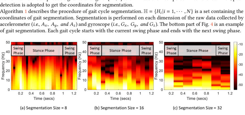
How to make a spectrogram from time series data?
I'm trying to make something like this:

I have a time wave and several waves corresponding to power at a certain frequency bin. I've tried googling "Igor Pro Spectrogram" and similar topics but nothing looks like what I want to plot. How is this accomplished?


It looks like a completely standard image plot of a 2D wave. Try something like
January 27, 2022 at 11:17 am - Permalink
In reply to It looks like a completely… by olelytken
"Image plot" is indeed what I want, thanks! I don't know why Igor doesn't include standard language like "spectrogram".
January 27, 2022 at 11:21 am - Permalink
Just thinking loudly here, without too much knowledge of the reasons for Igor's naming schemes and your particular field of study, but isn't 'spectrogram' specifically referring to frequency data such as audio or radiowaves etc.? Image plot is the generic term here to display any kind of 2D data (yes, even geographic maps and images such as bitmaps).
January 27, 2022 at 05:24 pm - Permalink
Check out Example Experiments->Movies & Audio->Sonogram Demo Experiment
January 27, 2022 at 11:31 pm - Permalink