Heatmap graph


Hello,
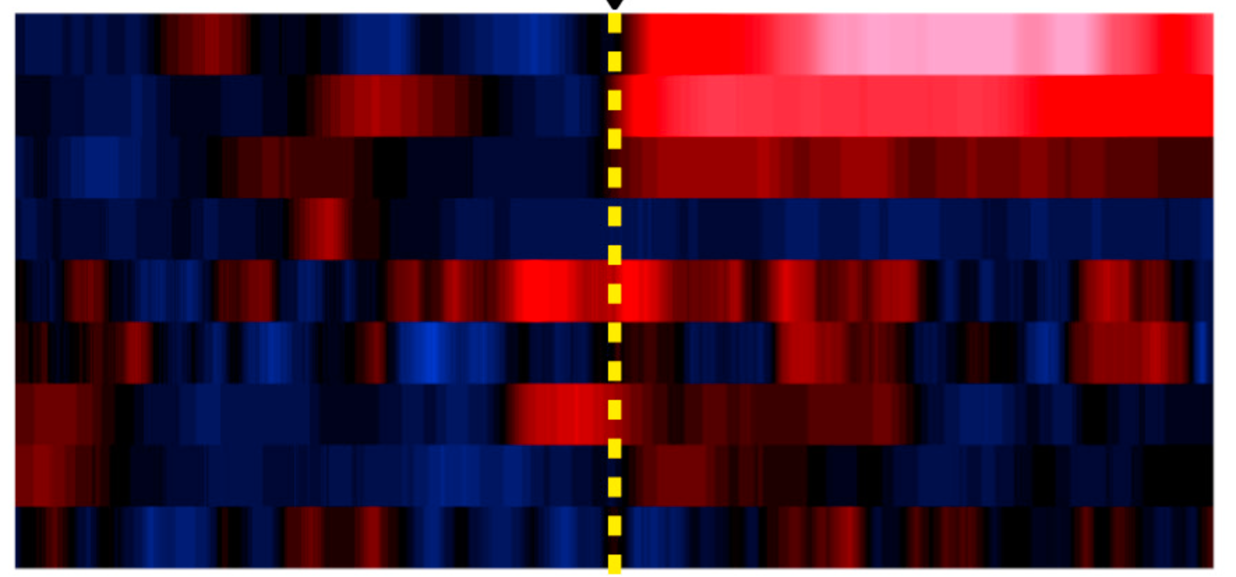
I was wondering which is the most appropriate way to have a visual representation of my data as the example attached. In the example: Y Axis, each row represent an individual. X Axis, correspond to the time. The color code is the z-score.
In my case, I would like to plot in the Y Axis several individual 1d waves. So, each row represent a 1d wave. In the X axis the time. All the 1d waves are scaled (in time units) and have the same amount of points. The color code should be the z-score already calculated in each separate 1d wave. So, my question is which kind of plot should I use, and also, how can I "bin" the data in order to have bigger "blocks" and adjust the resolution.
I was thinking to use something like JointHistogram but doesn't work with 1d waves.
Thanks.
You can get the effect that you want by concatenating all of the 1D waves you want to plot using Concatenate/NP=1 and then display this 2D wave as a NewImage. The binning problem you are referring to is OK, since you can manually resize the window/graph to get the height of each row as you like.
As an example:
For your example image you'll need a custom LUT as I don't think it is one of the defaults.
April 26, 2020 at 01:36 pm - Permalink
Thanks, actually works well! The color was just an example. And for the "bin" issue I use resample to control the "smoothness" of the blocks.
Thanks again.
Pedro.
April 27, 2020 at 12:05 pm - Permalink