Side-by-Side Histogram as Category Plot X-axis labelling?


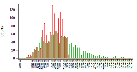
I've been attempting to juxtapose two histograms in order to better compare the two. As you can see in the example image I've been able to do so by generating two histograms and then displaying them as a category plot. However, the x-axis has been a bit tricky. Here I've taken the values from the srcwave_hist.x wave and converted them into a text wave which I've then used as the x-axis. However, it seems that igor insists on labeling each and every point. I've been able to remove labels for certain points (as you can see in the .PNG) by simply editing the text wave but this is rather inelegant.
I was wondering if there might be a more elegant and efficient approach to generating a nice, numeric category plot x-axis similar to the way we can edit x-axis labels for histograms?
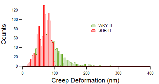
Ultimately, if I could produce x-axis tick labelling similar to that seen in the second example figure I'd be quite happy!
Much thanks in advance!
I have struggled with this also. What would be nice is to be able to set the transparency of a bar trace. What I came up with is to use one trace as bars and without a line to lighten up the visuals and then use cityscape for the second trace that is in front.
Andy
October 11, 2016 at 10:21 am - Permalink
You might be able to approximate what you want using Sticks to Zero display mode, and then slightly offsetting the X values of the two histograms.
John Weeks
WaveMetrics, Inc.
support@wavemetrics.com
October 11, 2016 at 05:36 pm - Permalink
October 12, 2016 at 06:14 am - Permalink