Interesting Visualization Example and Request for Analysis Strategy


Hi,
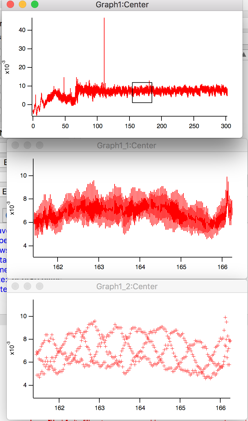
I am working on some data for client and in working through some of my usual tricks to look at data, it showed a phenomena where the choice of graph type can can fool you. It is data taken from a laser displacement sensor at 100 Hz. We were testing a metrology system. Plot out the data and there are some overall trends and then some trends that look like waves. I expand part of the range for closer look and you definitely see wave structures.
Then one of my usual tests is to switch to markers or points instead of lines between points and in this case a very different structure appears. When I did this in the weekly review meeting there was great astonishment. To my eye it looks like there are 3 wave structures overlapping as well as larger longer scale wave structure. Quite interesting. I found this a great example of the need for fast and flexible data visualization, but that probably doesn't need to be said in this forum.
Now the ask: If there are 3 wave-like sources plus possibly an overall longer period wave pattern, how would recommend going about and breaking this problem down and quantifying the individual components? I have attached a copy of the data for your amusement.
Thanks in advance.
Andy

Forum

Support

Gallery
Igor Pro 10
Learn More
Igor XOP Toolkit
Learn More
Igor NIDAQ Tools MX
Learn More
If you use line and markers mode, you may be able to convince yourself that the effect is just aliasing. See my much-expanded view attached.
November 15, 2018 at 05:05 pm - Permalink
I wondered about de-interleaving the wave. If the three patterns are regularly spaced then you can simply pull them out by wave assignment. My second thought was that they're unlikely to be exactly interleaved so the approach wouldn't work. Having read John's comment, perhaps if they can be de-interleaved it is just an aliasing effect?
November 15, 2018 at 10:57 pm - Permalink
Hi,
We are going to try to higher frequency data 1000Hz vs 100Hz and perhaps that will provide some clarity. I will keep you posted.
There are some mechanical/physical possibilities for the overlapping signals so it could be real. Assuming it is real but not neatly separated by point assignment any other techniques so quantifying the system?
Andy
November 16, 2018 at 06:31 am - Permalink
Take a look at this sin fit to a small portion of the data set. I think it's pretty clearly aliasing.
November 16, 2018 at 09:47 am - Permalink
Hi,
We ran a higher data rate experiment 1KHz versus the original 100Hz. The anti-aliasing is now more clear. Choosing different scales and styles highlights different aspects of the signal. The markers only with a somewhat expanded view shows the digitization of the sensor well which is expected.
The zoomed in shows a more wave-like structure though it is not a simple sine wave which is also not unexpected.
I consult on experimental strategy and data analysis and I strongly highlight the need to visualize the data. The ability to quickly switch styles and adjust zoom while a simple feature should not be overlooked. Most of my clients are still wallowing in an Excel so this quick analysis is often overlooked.
The higher rate data is attached for your amusement. FYI is from Keyence laser displacement sensor and the units are mm taken over a moving substrate.
Andy
November 17, 2018 at 04:07 pm - Permalink
Pretty interesting. Just to drive home the point about aliasing with a sledgehammer, I have appended a graph showing all the data in red with hollow circles, and another with every tenth point in solid blue circles.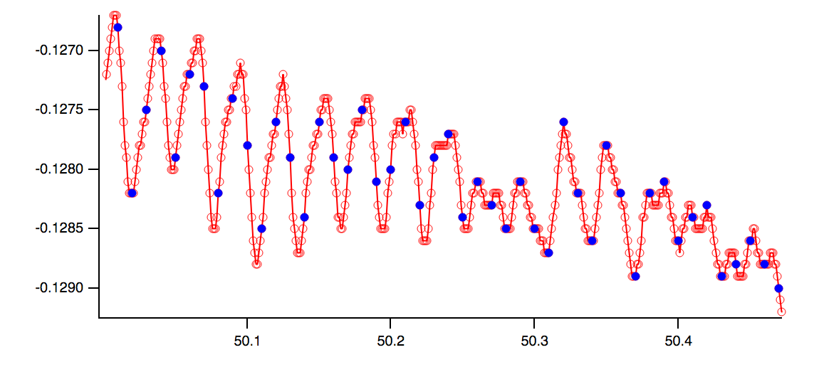
November 19, 2018 at 01:22 pm - Permalink
Andy- Thanks for the kind words about the easy graphing and zooming, which have been part of Igor for 30 years! The "easy" part masks a lot of pretty tricky code, especially when you zoom to extreme levels as we are doing in this thread.
November 19, 2018 at 01:24 pm - Permalink