In the Modify Axis dialog, on the Axis tab, set the default font size to something smaller. But you have a bunch of labels, and it's going to be really hard to make them readable.
The default font size is based on the graph window size. For a normal axis, the ticks are chosen to avoid overlap using that size. For a category plot, since you are telling Igor what labels to use, and how many, Igor can't omit some labels to make them fit. It's like manual ticks, with which you can produce some pretty awful graphs!
I suppose it would make some sense in that case to try to find a font size that makes the many tick labels fit; it would have to restrict itself to sizes smaller than the default in order to avoid ridiculously big sizes on graphs with few labels. That would also avoid changing the appearance of older graphs made before such a change.


Can you post a MWE?
October 3, 2019 at 03:25 pm - Permalink
Hi,
Your command is my wish.
Andy
October 3, 2019 at 03:35 pm - Permalink
In the Modify Axis dialog, on the Axis tab, set the default font size to something smaller. But you have a bunch of labels, and it's going to be really hard to make them readable.
October 3, 2019 at 04:38 pm - Permalink
Hi,
Thanks. Knew is was somewhere.
Andy
October 3, 2019 at 04:56 pm - Permalink
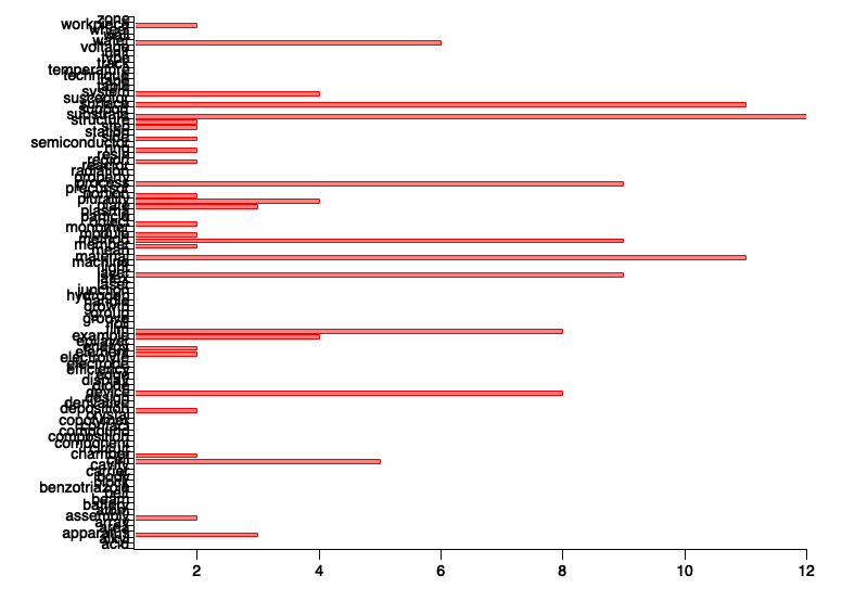
@hegedus: Thanks for the example!
I'm too late for the answer but ...
@John: Is there a way to ask Igor to find a font size so that the axis text (or in my case tick labels) don't touch?
October 3, 2019 at 05:04 pm - Permalink
The default font size is based on the graph window size. For a normal axis, the ticks are chosen to avoid overlap using that size. For a category plot, since you are telling Igor what labels to use, and how many, Igor can't omit some labels to make them fit. It's like manual ticks, with which you can produce some pretty awful graphs!
I suppose it would make some sense in that case to try to find a font size that makes the many tick labels fit; it would have to restrict itself to sizes smaller than the default in order to avoid ridiculously big sizes on graphs with few labels. That would also avoid changing the appearance of older graphs made before such a change.
October 3, 2019 at 05:16 pm - Permalink